background
The Fire Tablet design team had been advocating for a redesign of the home pages for over a year. Leadership green-lit the project after reviewing a Voice of Customer report that highlighted problems and areas of opportunity. Customer research, anecdotes, and usage data showed us that customers were dissatisfied with the previous home page UI. Diving deeper, we found that:
1) Customers wanted a simpler and more convenient way to re-engage with their content.
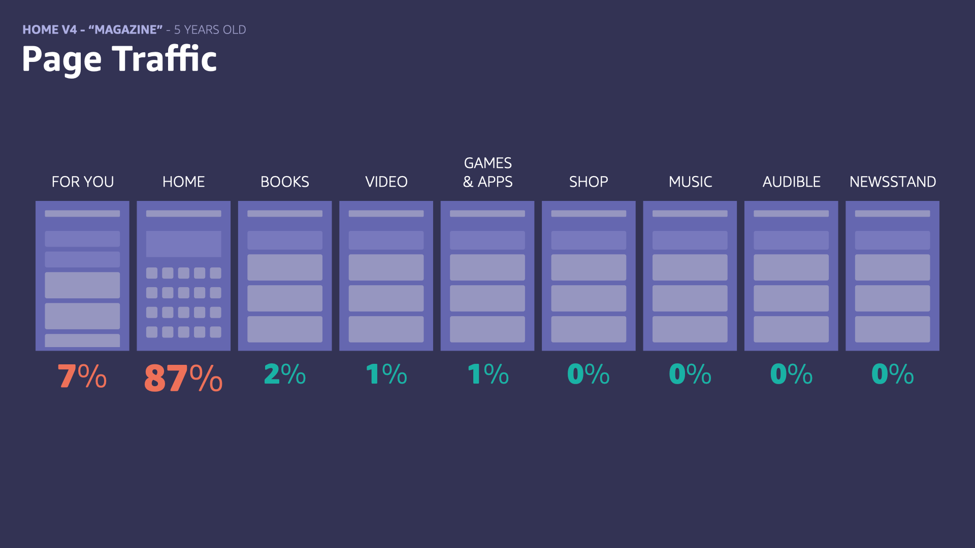
2) When customers used the home page features/UI, it was primarily for re-engagement, and tenured customers rarely used it at all.
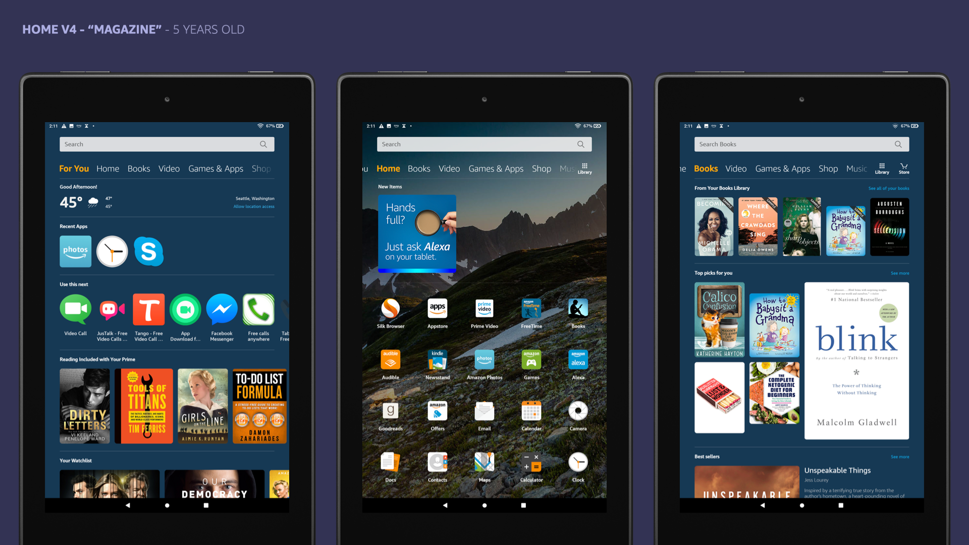
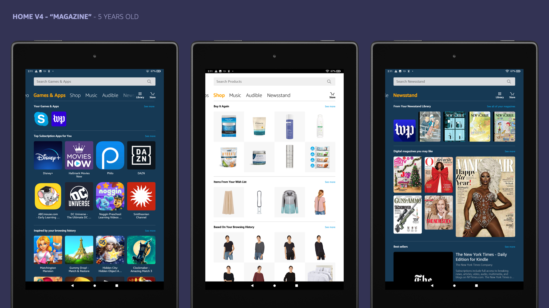
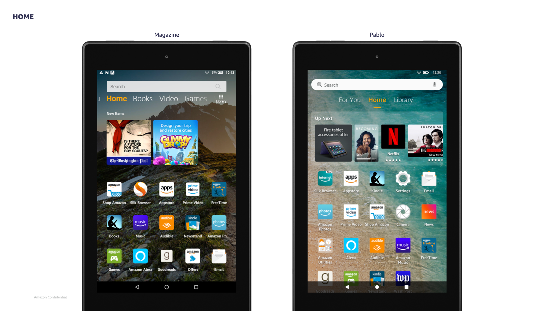
"Magazine" - the existing home pages model that we wanted to redesign.
project goal
Design, present, and QA the front-end CX and a scalable infrastructure for redesigned Fire Tablet home pages.
my role: Lead UX Designer and Design Manager
team: Two UX Designers, Visual Designer, UXPM, two PMs
timeline: 2+ years, from initial ideation to launch
Large features like this required a complex working-backwards schedule. To illustrate the important overlapping deadlines and deliverables when meeting with partner teams, I created a milestone graphic.
headwinds
1) Ineffective design manager leading the tablet team at the early stages of exploration. I was put in charge and promoted to manager after designing the early version of Home we ended up shipping.
2) It required data to convince leadership to make substantial changes, but we couldn’t collect reliable data without first investing in changes.
3) Design solutions were limited by 3P content availability, nonexistent business deals, and the capabilities of the personalization and science teams responsible for content recommendations.
4) There was constant tension between business and customer desires. We were continuously pushed to explore options that conflicted with reliable data indicating clear user preferences regarding advertising and home screen use for Amazon-owned content.
5) The Fire Tablet team lacked assistance from a dedicated user researcher, forcing us to look elsewhere for customer anecdotes and data related to the home pages. Only later, after our designs received buy-off from Dave Limp, did we have an opportunity to run a qualitative user study.
early research and data gathering
In early 2018, the Voice of Customer (VoC) team within Amazon deconstructed thousands of Fire Tablet customer reviews, highlighting sentiment and any specific mentions of home experiences. The analysis identified the following key areas of opportunity:
1) general usability / layout: Customers found the layout of Fire OS cluttered and confusing, lacking the simplicity of Apple and Android tablets. They expressed frustration over the apparent redundancy of product tabs along the top of the home screen and product icons on the home screen.
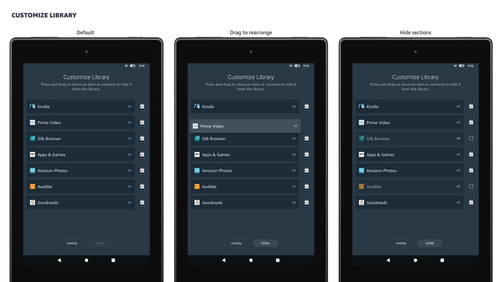
2) customization / personalization: Customers complained that the OS layout/setup was too locked down, preventing customization. They requested the ability to hide redundant and/or unused apps and pages.
3) finding content: Customers struggled to quickly and easily access their media content. They wanted clear visual indications of where and how to find already-purchased content.
4) advertising: Customers found the recommendations presented across product pages overwhelming and heavy-handed, giving the devices a reputation for only pushing Amazon products on customers.
In early 2019, an external agency evaluated various areas of the Fire Tablet and highlighted top opportunities. Key findings included:
1) Users were generally happy with their Fire tablets and didn't perceive the Magazine UI as ‘broken’.
2) However, users desired a simpler, more personalized, and frictionless experience.
3) Participants described the current pages as “cluttered” and “busy” and welcomed a “cleaner” and “more organized” layout like the early Pablo layout (3-page) they were shown. The average user visited only 1.3 pages regularly.
design process
1) I was one of several designers initially exploring new designs for the home pages. After several months and dozens of iterations and reviews, my designs became the official plan of record. My expertise in all things Fire Tablet-related, combined with strong partner relationships and a tendency to be Right A Lot, made a compelling case for my promotion to Design Manager.
2) I presented the new designs to Dave Limp twice before receiving final approval to move forward. The second pass was a request from him to do a deeper dive into explorations of monetization opportunities. Through a partnership with the Ads team, we determined that the redesigned home should not include additional ad placements.
3) I coordinated an incremental deliverables timeline designed to keep the Engineering team busy while my team finalized all designs.
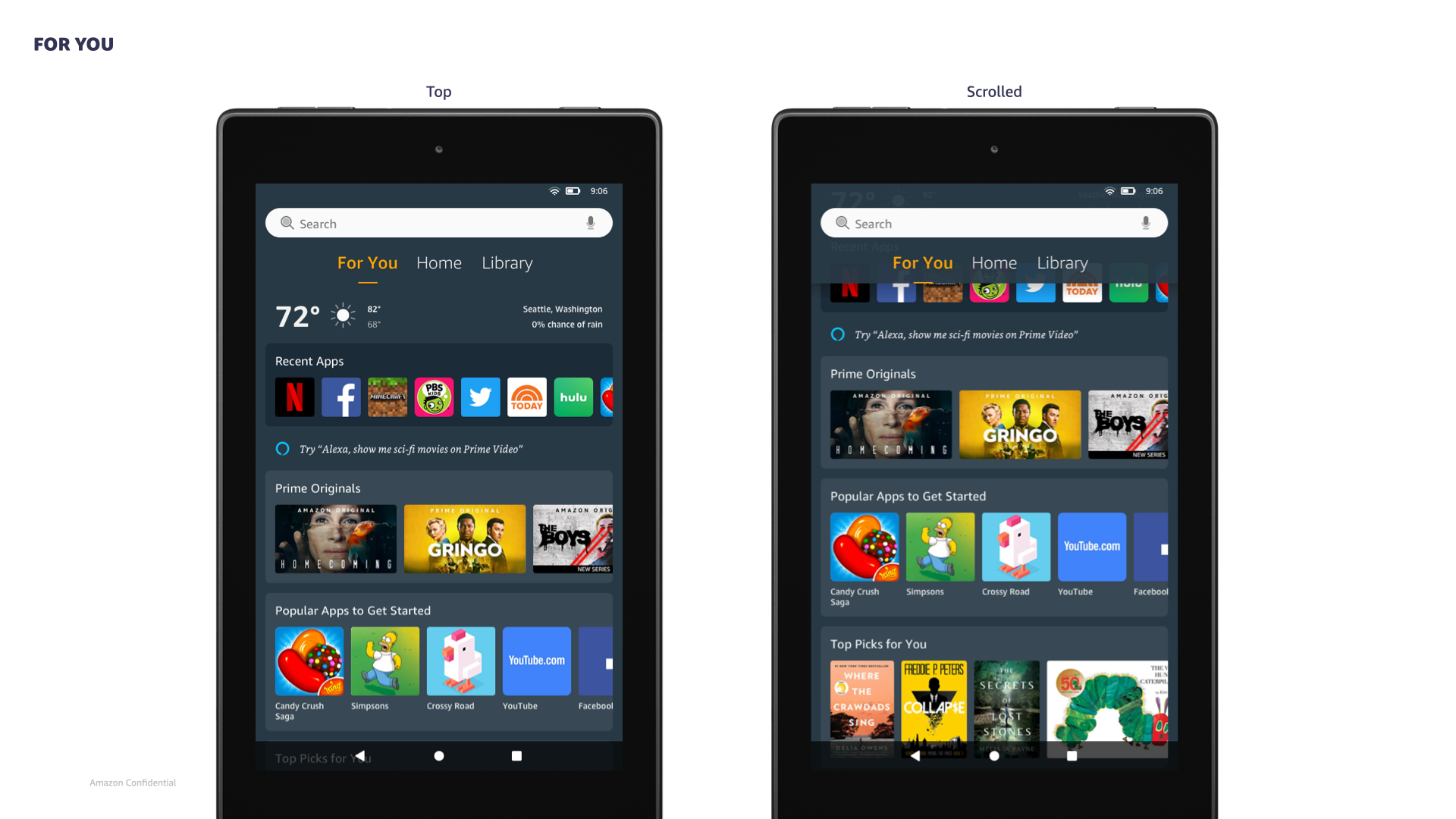
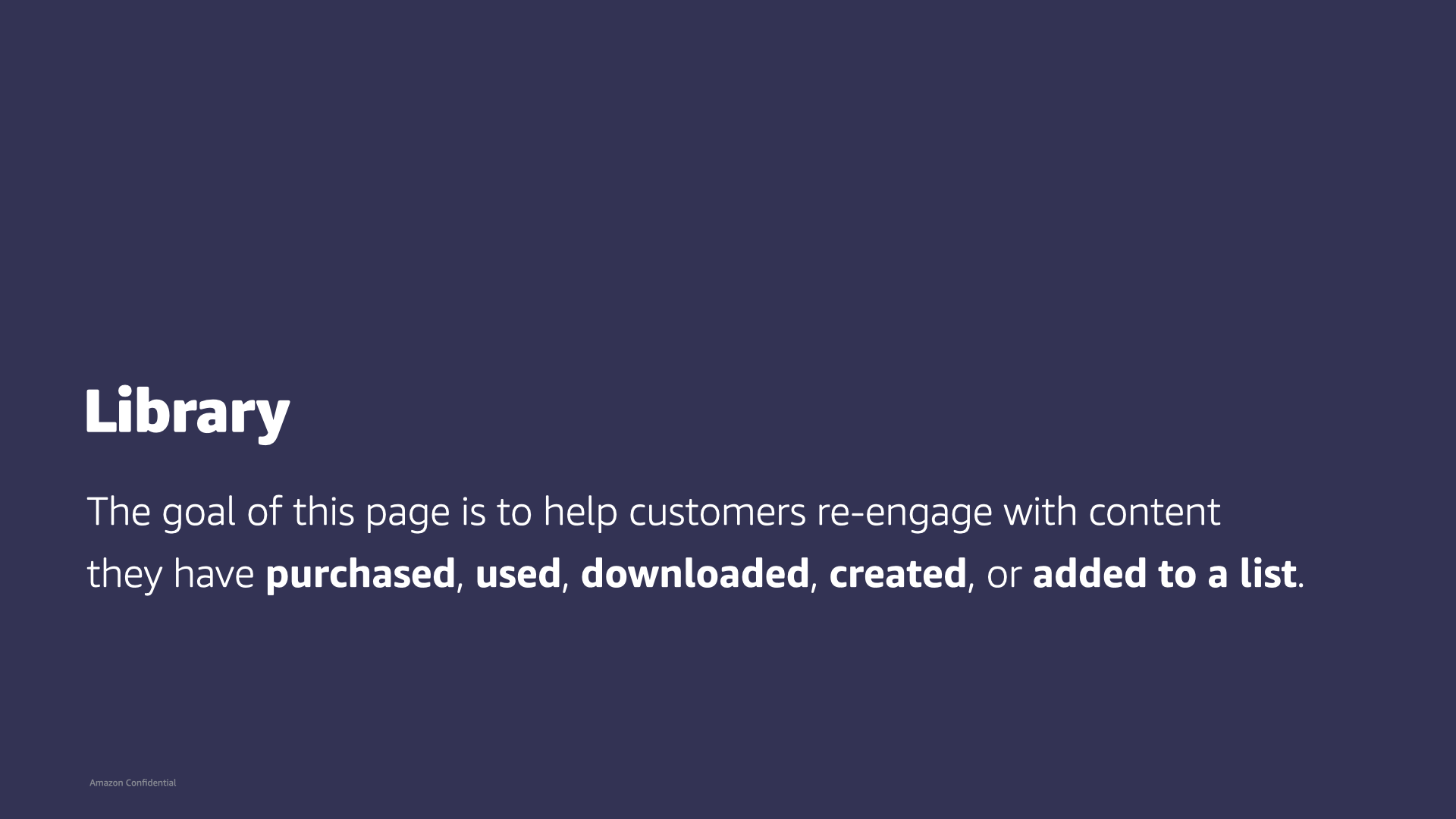
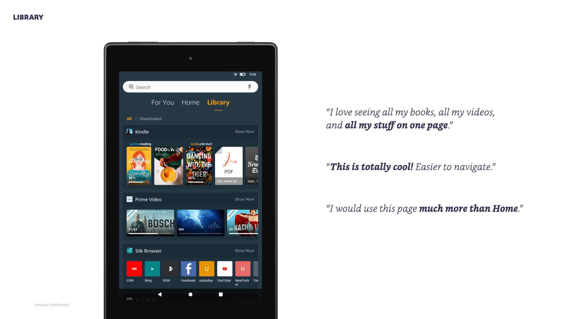
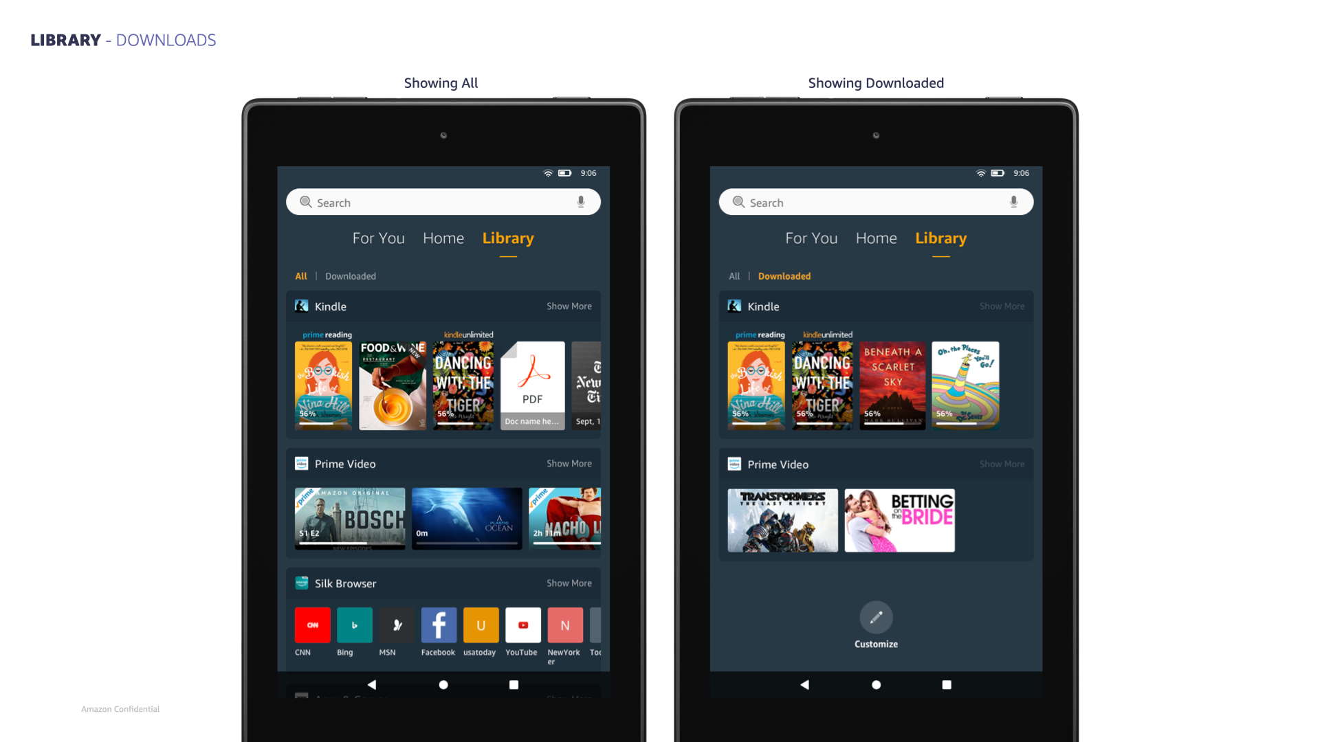
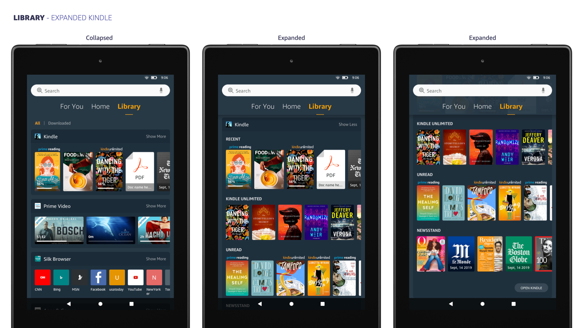
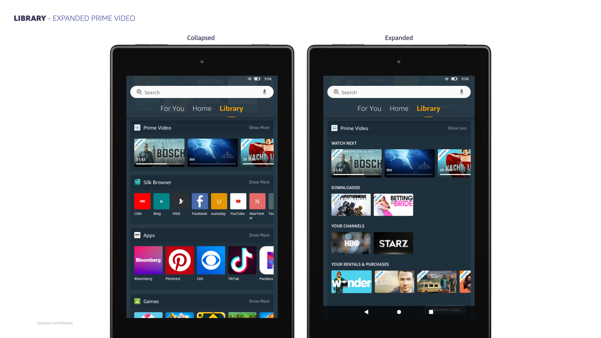
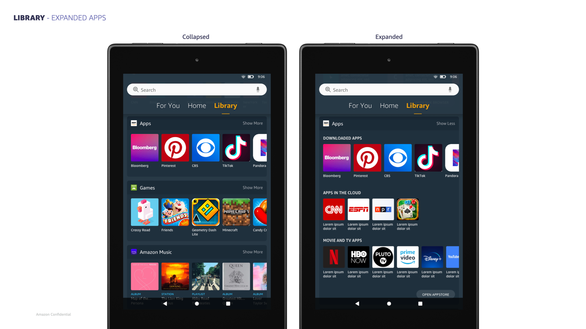
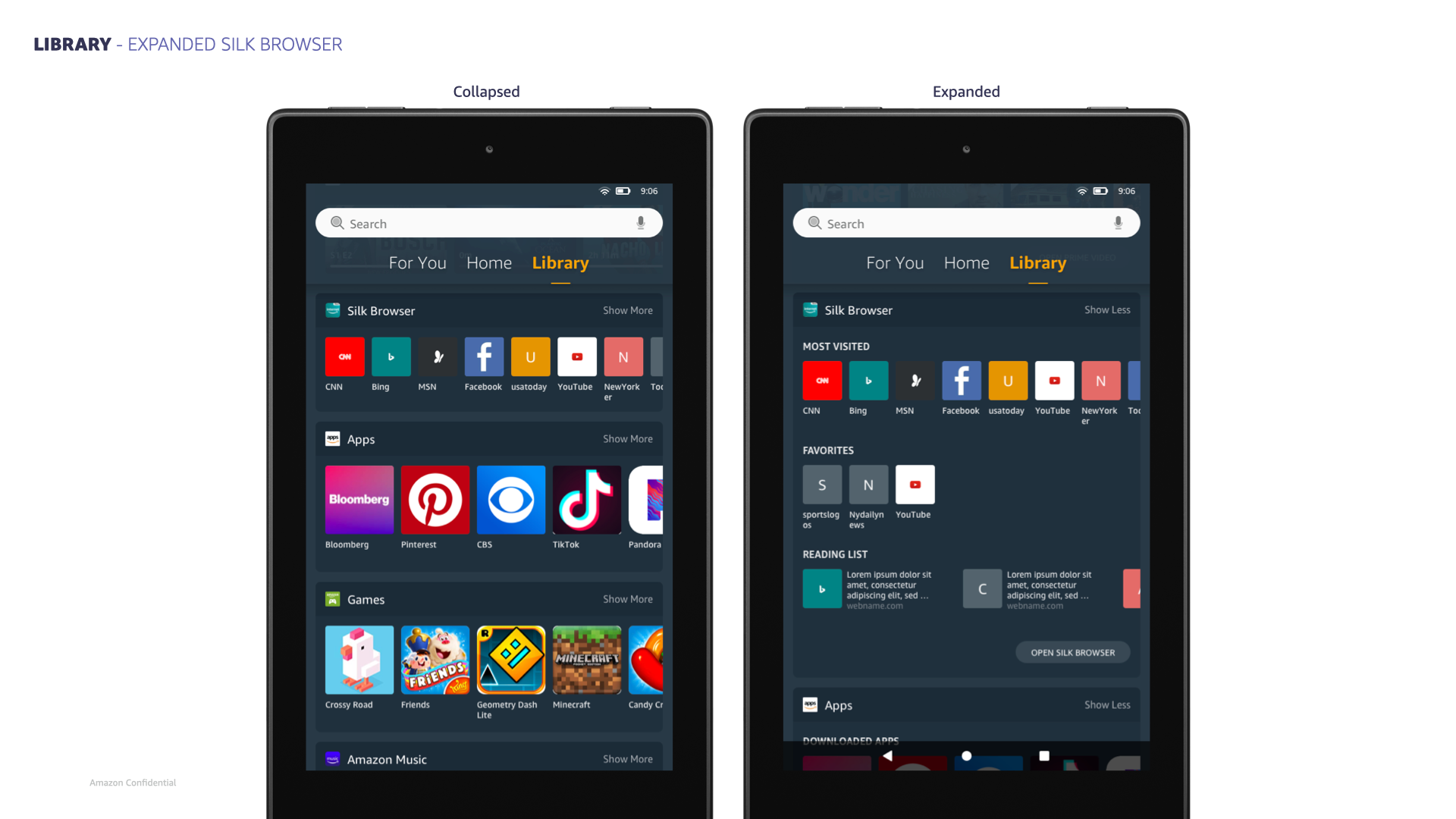
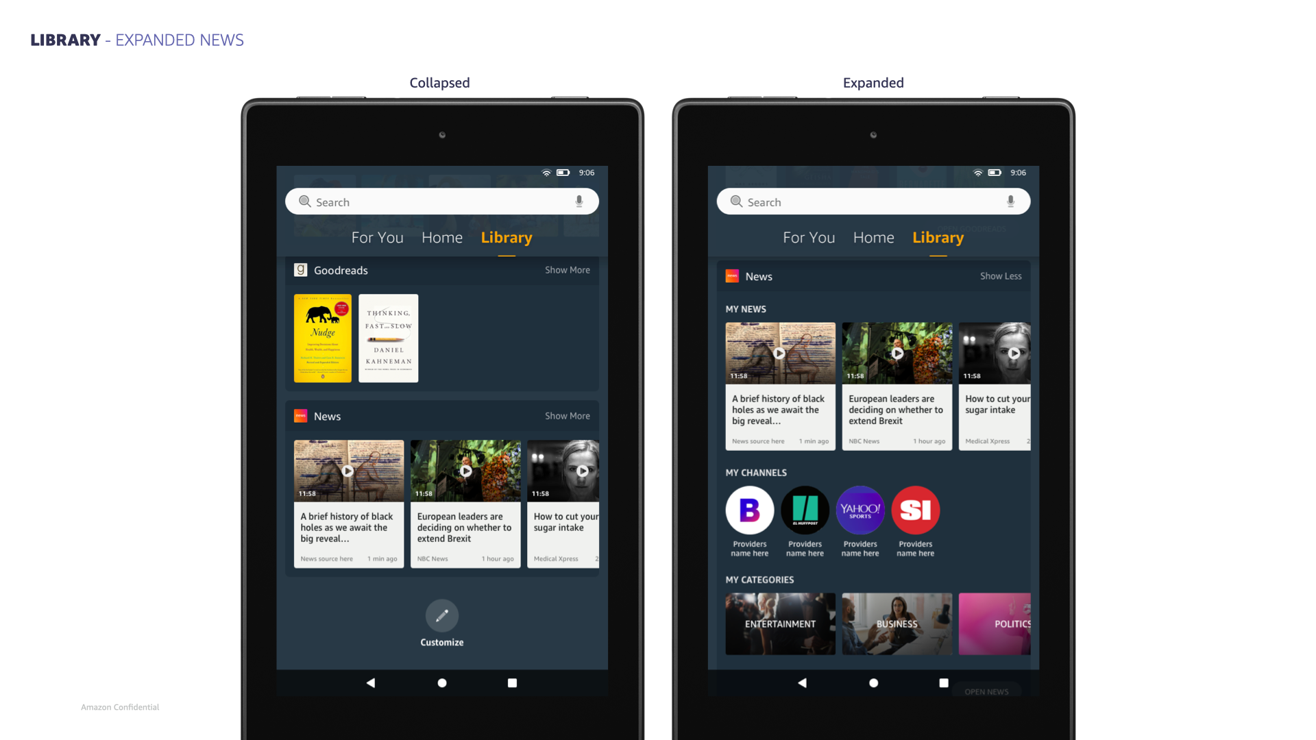
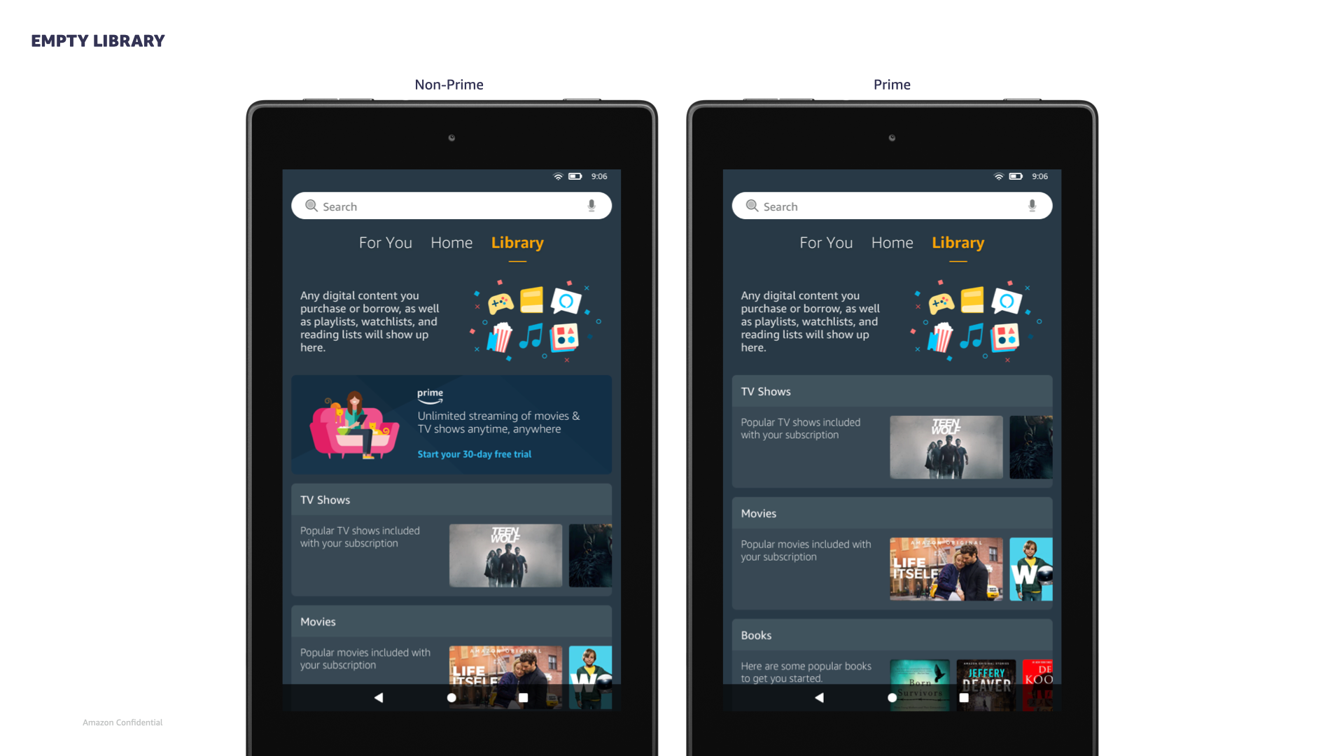
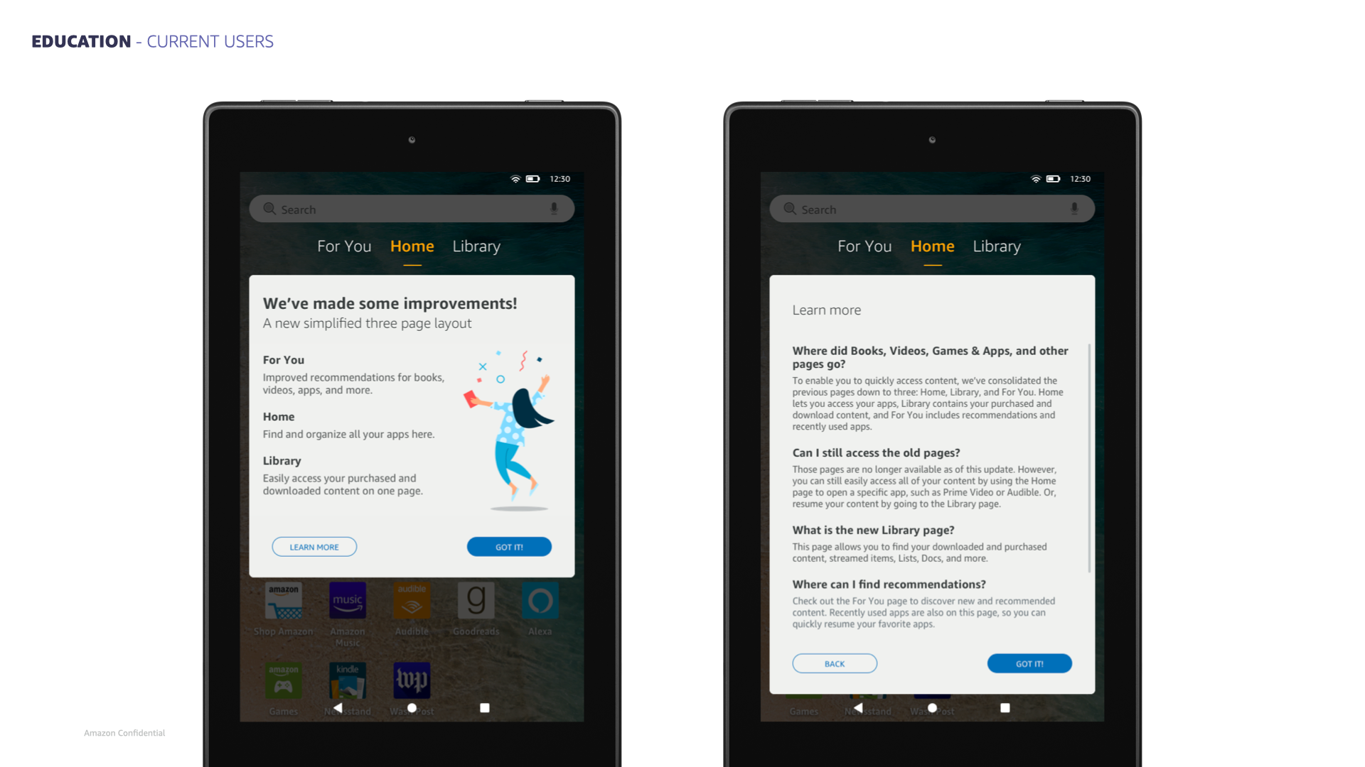
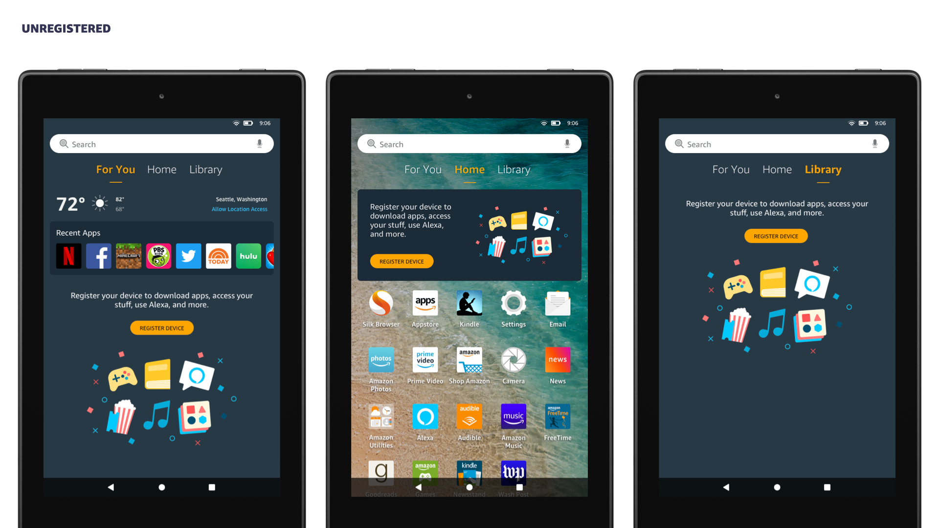
4) I designed a set of home pages that utilized all four bezel swipe directions for core navigation. The center home and the vertical space beneath it were dedicated to an app grid. To the left of the home was a “For You” page for personalized content discovery. To the right was a customizable “Library” page for organizing and resuming all partially consumed or modified content. Above the home was the system quick settings and notification tray, a universal pattern on mobile devices.
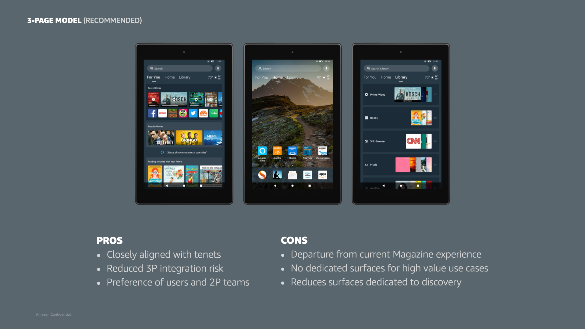
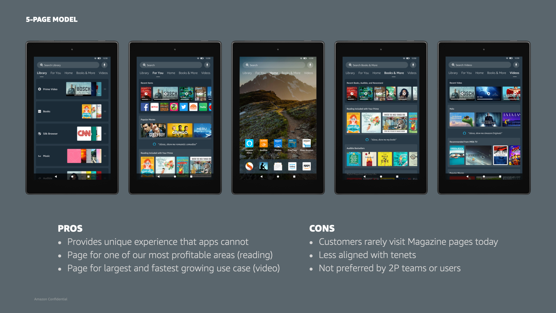
Exploratory home models we used into early research studies, and eventually presented to leadership.
validation testing/feedback
During exploration, we conducted a qualitative study where nine tablet users performed a series of key tasks using three new home models we were considering. Key findings included:
1) Simplicity and organization were frequently mentioned as ideal traits.
2) Participants desired more customization and control over their tablets, like changing the wallpaper or removing preloaded apps.
3) Perceived density of advertising was a key factor in whether participants liked a given layout or found it “too busy”.
4) Participants preferred more verbose, less iconographic designs, such as a top navigation with page names instead of bars or icons.
5) Six of nine participants preferred the 3-page model, but it was unclear how many pages most participants would use. However, all nine participants liked the updates.
Two rounds of beta testing were conducted with nearly 700 internal employees from the four countries representing our top Tablet marketplaces.
In 2020, the UX team was involved in the formal devices Beta process for the first time. As the newest Tablet manager, I quickly cemented design’s involvement as the new normal moving forward. I personally authored the majority of beta survey questions, resulting in more actionable evaluative feedback. Results: Increased overall customer satisfaction (CSAT) from 5.85/7 to 6.18/7.
"Pablo" - the new home pages model we shipped in 2020.
results
The redesign led to more engaged and retained customers, resulting in more Launcher impressions focused on higher value pages. The largest engagement improvements were from new tablet customers and our least engaged customers, a positive sign for retention. Additionally, the redesign diversified usage, driving improvements to businesses beyond those previously on dedicated pages closer to Home. It will enable Fire Tablets to effectively scale new businesses as priorities shift over time (e.g., productivity), allowing our machine learning models and customer preferences to dictate content priority on the home screen. Additionally, ongoing design and engineering costs were greatly reduced through the implementation of a much more scalable design system.


learnings
1) It takes more than two years to redesign Fire Tablet home pages at Amazon. While the need for redesign was obvious to the design team, data was ultimately required to convince Fire Tablet leadership to take any significant risks.
2) Business development partners were unable to sign the deals required to fully realize the potential of the Library page as it was designed and sold. It’s nearly impossible to convince 3P content providers to share any of their usage data (e.g., recently watched within Netflix), even if it would greatly improve the overall customer experience.
3) Personalization and science teams were unable to significantly raise the bar high enough to meet the potential of the For You page as it was designed and sold. Machine learning models for recommended content still have a long way to go before they adequately meet most users' needs.
